")
Tesla Newsletter Design Styling
- 17 April, 2025
- Benjamin Winter-Leinweber
- 6:46 pm
Model Y Available to Test Drive - 11/04/25
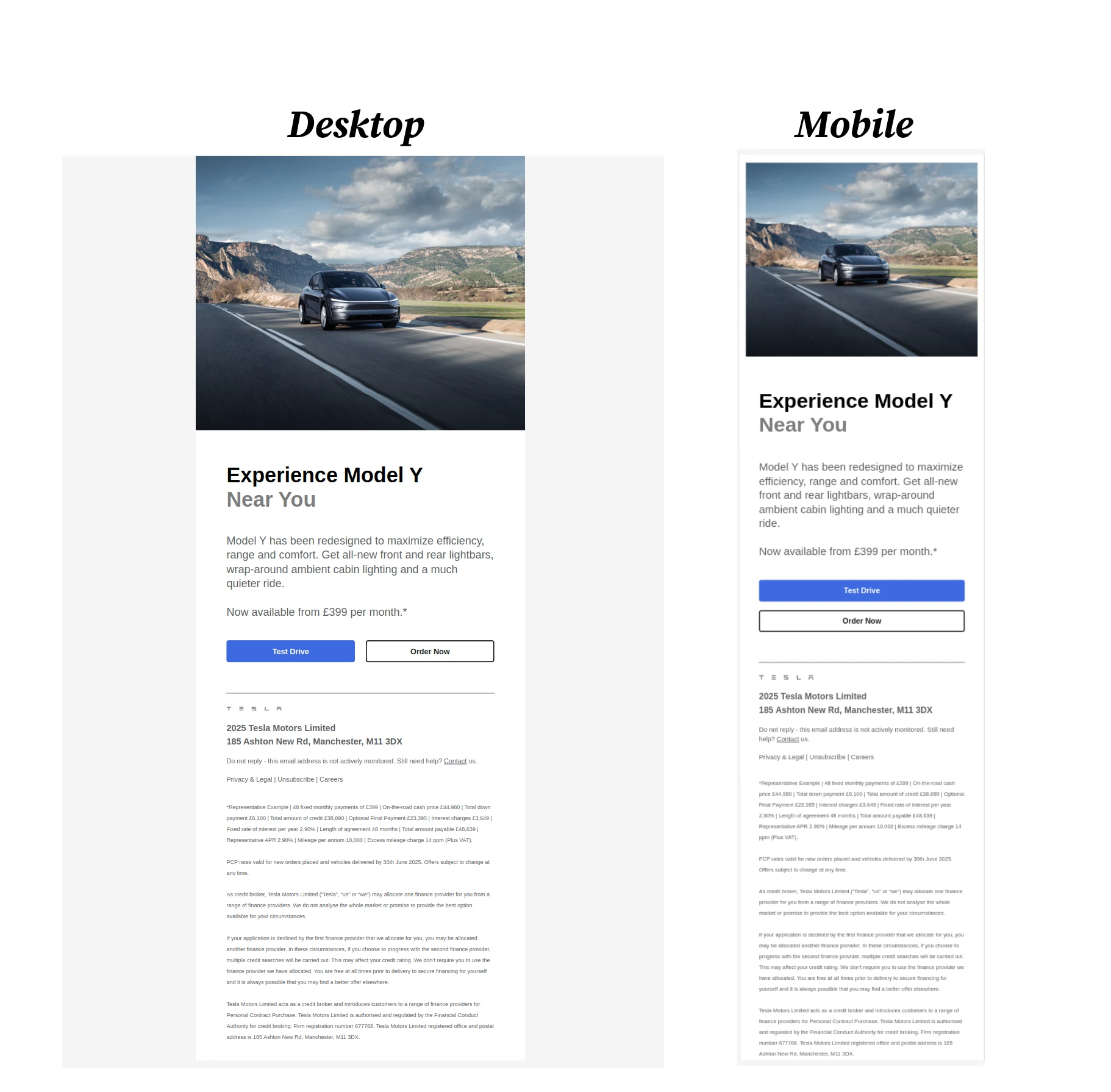
In this blog posts I’ve analysed how Tesla newsletters are styled. The goal is to showcase modern newsletter design ideas in an easy to use format for designers & small business owners. Modern newsletters usually have two version, one that’s optimised for mobile devices (less than 600px width) and another one for devices that are larger (than 600px width). Tesla’s newsletter also has two versions. Please refer to the image below.
Deconstructing The Design
We will be looking at the white space surrounding features like the text and buttons, and also the styling of the features themselves. Whilst the design is very clean and simple, we’ll see that there are many subtle design choices. Below I’ve listed the differences between the two displays (if any). The newsletter service that you are currently should allow you to adjust the design parameters that I’ve listed in the tables below.
Padding Explained
Before we jump in, it’s important to explain what padding is: An element’s padding area is the space between its content and its border. The green area below

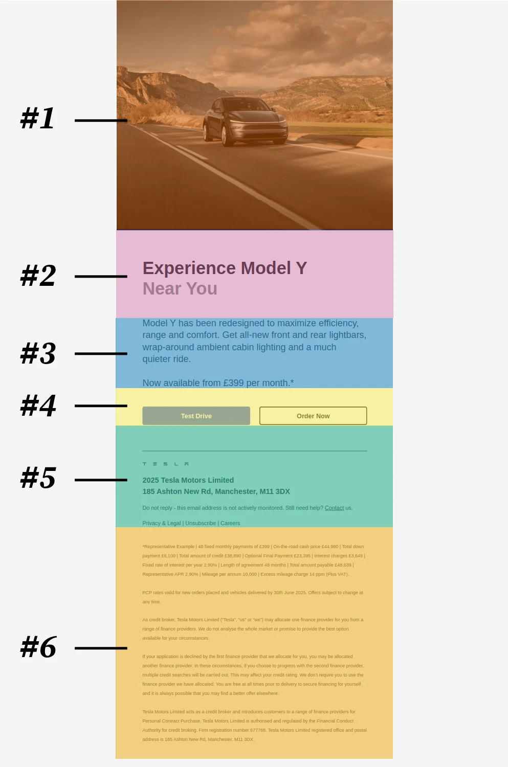
#1 - The Image Banner
Note: The banner image has a width-to-height ratio of:
Width = 1.2 * Height.
| Element | Tablet, Laptop & Desktop | Mobile |
|---|---|---|
| Banner Image |
|
⬅️ Same as this. |

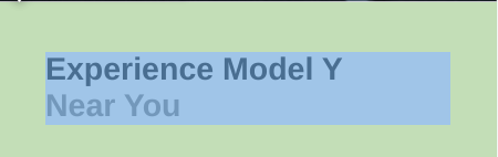
#2 - The Title Section
| Element | Tablet, Laptop & Desktop | Mobile |
|---|---|---|
| Main Title Padding |
|
|
| Main Title |
|
⬅️ Same as this. |

#3 - The Main Paragraph Section
| Element | Tablet, Laptop & Desktop | Mobile |
|---|---|---|
| Paragraph Text Section Padding |
|
|
| Paragraph Text |
|
⬅️ Same as this. |

#4 - The Call To Action Button Section
| Element | Tablet, Laptop & Desktop | Mobile |
|---|---|---|
| Button Section Padding (Both Buttons Are Inside This) |
|
|
| "Test Drive" Button (Blue) Container. The Positioning Of The Button. |
|
|
| "Test Drive" Button (blue) |
|
⬅️ Same as this. |
| "Order Now" Button (White) Container. The Positioning Of The Button. |
|
|
| "Order Now" Button (white) |
|
⬅️ Same as this. |

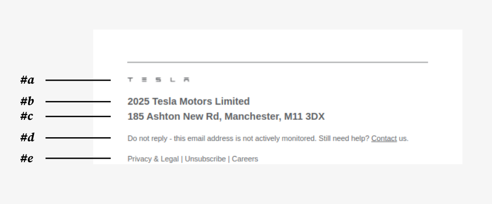
#5- The Footer Section
| Element | Tablet, Laptop & Desktop | Mobile |
|---|---|---|
| Footer Section Padding |
|
|
| (#a) Tesla Logo |
|
⬅️ Same as this. |
| (#b) Company Info Text Line 1 |
|
⬅️ Same as this. |
| (#c) Company Info Text Line 2 |
|
⬅️ Same as this. |
| (#d) Company Info Text Line 3 |
|
⬅️ Same as this. |
| (#e) Company Info Text Line 4 |
|
⬅️ Same as this. |

#6 - Disclaimer Section
| Element | Tablet, Laptop & Desktop | Mobile |
|---|---|---|
| Disclaimer Section Padding |
|
|
| Disclaimer Text |
|
⬅️ Same as this. |
Conclusion
This Tesla newsletter is designed mobile first, and all information is presented in a single column format. Most elements on the page are sized in a multiple of 2px.